Everything’s been a bit quiet on here recently, because I’ve been busy with the concept doc – here it is!
Introduction
My research project focuses on the idea of meditational games, and the way that effects art can be used within them. As such, the project is both an effects design and a game design endeavour, and the media examined may reflect both of these threads or only one. I have structured this document to first introduce the reasoning behind my effects creation process and then move on to talking about the development of the influences behind my game prototype.
Effects Process Influences
I have decided to explain the influences on my effects design process first, rather than creating this document in a chronological order, as I think it makes it clear why I have examined games and interactive media in terms of general aesthetic design and the way effects are used, rather than analysing individual effects.
Disregarding Game Effects as an Influence
When discussing his move to The Chinese Room, an independent developer that creates experiential, narrative based games, effects artist James Watt talked about how he was “fatigued of making muzzle flashes” (Gamespot, 2014), feeling artistically constrained by the expectations of AAA effects art to look like other AAA effects art. Watt was hired when he stated that his philosophy when creating effects was to look at his experiences and the real world, and that he is not inspired by other games. (Gamespot, 2014) I really admire The Chinese Room for their ability to push the boundaries of what a game is and can do, as well as the way they deliver their narrative. Watt discussed feeling his way through the effects (Gamespot, 2014), something I would very much like to do with my prototype, as it aims to produce emotion. Therefore, I felt that Watt’s manner of gathering inspiration would work well for me.
In response to this when creating effects I thought about how that particular phenomenon made me feel, or how the “physics felt” something that Joseph Gilland, effects animator at Disney and author of “Elemental Magic”, thinks is incredibly important. (Gilland, 2009) As well as talking about how observation from life is important, he discusses the idea that effects art is all about the underlying energy, and learning how this energy works in an artistic, rather than scientific sense, is the key to becoming a good effects animator.
An example of how I used these ideas in my work was when creating realistic water effects. I was at the train station in the rain the day before these were made, and recorded videos of water dripping from the canopy on to the platform. I also thought about how the rain felt when it hit me or splashed, thinking about the mood it created – dreary when out in it, quite nice and relaxing when sheltered – and the way the movement felt in order to recreate it. To consolidate this knowledge I created gesture drawings from the video later. I think I almost applied this knowledge in the same way that a character animator might apply their knowledge of performance to their characters. By doing this I feel that I added to the sense of life that my effects bring to my game.
Theme as an Influence on Effects Colour, Shape and Movement.
I also looked at “Diablo III” as an influence on my process. The Blizzard effects team aims to depict the themes and personalities found though their spell effects. This is done through use of colour, shape and artistic symbolism drawn from world cultures, rather than drawing from the look of effects in other games. “So when we sit down and design a class, we do talk at a really high level about what kind of themes we want to evoke with that class. And inevitably, there are certain colour schemes that come out of that. And so we do end up with a little bit of a mental chart of colours that we would rather not have associated with a certain class.” (Blizzard Entertainment, 2012)
When designing the holy monk character’s effects, the team chose whites, silvers, golds and blues; liturgical colours associated with the Byzantine Rite in Catholic traditions and the colours of the Buddha and the Buddhist flag. This draws on ideas embedded in world cultures, using visual shorthand to aid players in immediately associating these spells with spiritual powers and holy fire.
This was also used with the witch doctor class, drawing inspiration from voodoo and poisonous animals. (Blizzard Entertainment, 2012)The team stated that they felt as if fire and poison “really belonged” to the character, so were able to build up a sense of identity through the effects. They picked greens and purples, as they felt these colours were really thematic. I suspect that this is due to the fact that these colours may be found in a swamp, a setting that is stereotypically associated with voodoo magic.
By using different colour schemes for each class the developers are able to separate the effects, which is really important in a game where there are so many enemies on screen at once. (Blizzard Entertainment, 2012)
The shape of “Diablo III”’s effects are created in a similar manner, with the artists aiming to communicate the theme while also telegraphing power. (Blizzard Entertainment, 2012) Shape association relies on societies’ common experiences with shapes, such as triangular pointed objects being dangerous. (Dondis, 1973) Returning to the monk example, the character itself was very round, using peaceful shapes like circles and spirals. These are echoed in the shapes of its effects, with circular area of effect spells making up the bulk of the monk’s move set. However, these circles animate in fast, angular motions, linking the ideas of the peaceful monk and the powerful fighter.
Though I may not be trying to describe the personality of a character with my effects, I certainly have ideas and themes that I wish to communicate. These deal with meditation, self-reflection and spirituality. I used Blizzard’s process when creating my Butterfly effects. As butterflies have often been seen as a symbol of the soul, death or spirituality in Asian cultures (Hearn, 1968), I thought they were a perfect motif to use in my meditation focused game. I aimed to invoke a calm, nature centric feeling, as they were designed to be coupled with the dust and godrays in the nature-themed room. In Colour, by Zelanski and Fisher, I read that blues and greens are associated with the cooling qualities of water and trees and that cool colours are generally much more relaxing, as they “slow down out heartbeats, decrease our temperatures and relax our muscles”(Zelanski, Fisher, 1999). I wanted the butterfly to lead the player into an introspective state, so used colour to symbolise spiritual development and awakening. “Clear blue or lavender indicate a high spiritual development, orange a predominately intellectual nature.”(Zelanski, Fisher, 1989) Due to these cultural associations with the colours, I chose to use a light blue and a cool version of orange. The butterfly movement is in slow, soft circles, as circles are associated with peace and safety. (Dondis, 1973) This allows the player to be drawn in slowly, comfortably and be allowed to relax.
Abstract Art Influences on FX Design
As my game design research became more focused on meditation, I became interested in the link between meditational experiences and abstract art. As such, I looked into abstract artists and animators and this fed into my effects practice within the second prototype.
Emotional Abstraction
Patrick Herron is a Tachist painter who uses the idea of “emotional abstraction” or hyper-sensitivity to the characteristics of a location, to recreate the feelings and mood associated with a place within his paintings without representing it figuratively. (Cole, 2012) He sees his work as an immersive and liberating experience, as the viewer is drawn into the emotion of the piece, but is free from representation. (Cole, 2012)
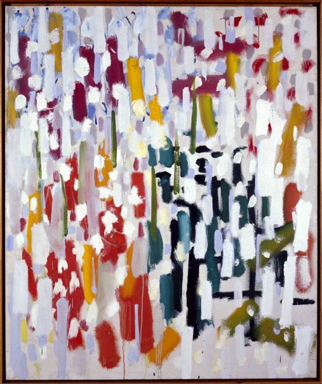
In “Azalea Garden” (Heron, 1956), he uses bold colour and free brushstrokes to invoke the idea, though not the image, of his garden. Herron takes influence from the colours, shapes and textures found there (Tate, 1984) and represents foliage with wild, overlapping brushstrokes. The juxtaposition of heavily saturated reds, blues, greens and yellows compliments boldly and brings with it the idea of a bright summer’s day, communicating warmth to the viewer. Paint was applied to the canvas directly from the tube, simultaneously creating colour and line, so that the negative space in the painting serves as a sort of bridge between areas of colour. (Tate, 1984)
When creating an abstract version of my water effect, I used Herron’s method of emotional abstraction. I focused on the idea of dripping water by observing shapes created by the movement and then taking them down to their closest primitive shapes. I also used heavily saturated blues, like in “Azalea Garden” (Heron, 1956) and a bright white, rather than a complex refractive material. By keeping the same movement and underling energy that the realistic water contained, but grossly simplifying the elements of shape and colour, I was able to communicate the idea and feeling of a water effect, without representing one figuratively.
Visual Strategies and Meditational Imagery
Abstract animators such as William Moritz, Jordan Belson and James Whitney use visual strategies and meditational imagery within their work to create a sense of self-reflection and interpretation within the viewer. (Furniss, 2007)
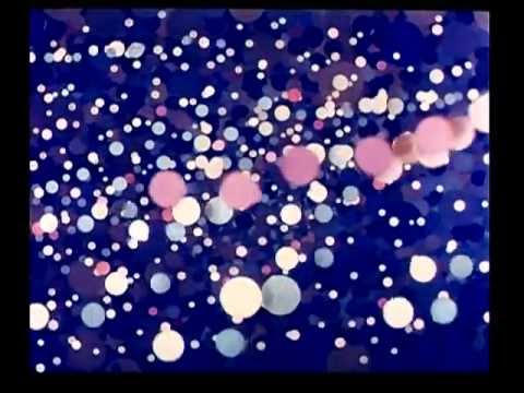
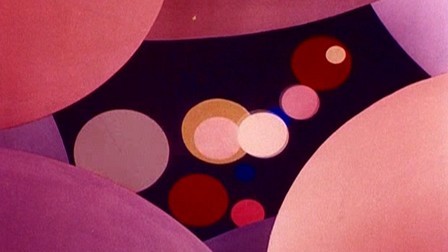
Abstract animation often lacks a defined narrative, and uses a poetic structure to explore themes or emotions, much like in some of the games I will discuss later. Oskar Fishinger’s “An Optical Poem”(Fischinger, 1937) is an example of this, using the structure of Franz Liszt’s “2nd Hungarian Rhapsody” to create a dance of shapes that could resemble a voyage though outer space, or the breaking of biological cells – it is completely up to the viewer. The only definite is that the shapes and colour match the emotional tone of the music – a dark blue circle is a low smooth note, whereas a white triangle is a high, fast staccato note. Each element was created very deliberately, with Fischinger keeping this abstract meaning at the forefront of his practice. (Furniss, 2007) This incredibly personal structure can become an instrument for meditation, creating a personal relationship between the film and the viewer that blocks outside stimuli. (Furniss, 2007)
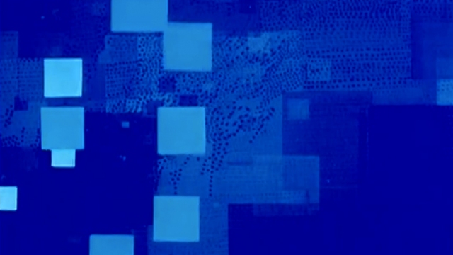
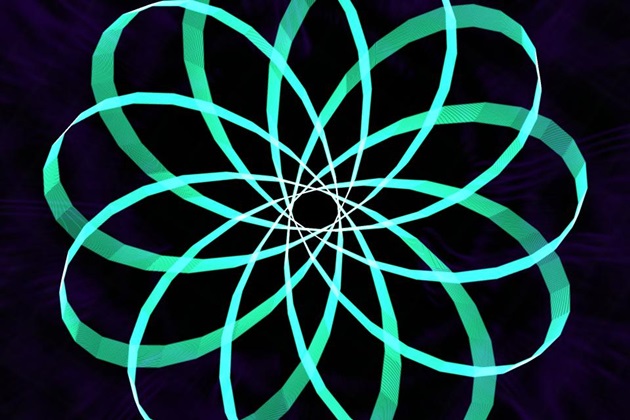
James Whitney’s “Lapis” (Whitney, 1966) makes use of meditational imagery to help the viewer concentrate on the film and relax. Mandalas, symmetrical images used to aid meditation, are a common theme in his work. They are often circular, square or lotus shaped and represent the cosmos, deities, knowledge or magic. (Furniss, 2007) When still, they aid concentration, as fixing the eyes on one creates visual deprivation, stabilising it in the retina. (Furniss, 2007) The mandala in an animated state is slightly different as the movement prevents this experience, but the viewer can still become entranced by light when coupled with rhythmic, hypnotic imagery. (Furniss, 2007) The spectator’s vision is pulled inwards though shapes becoming smaller and focused by shapes becoming larger. Images that transform from dark to light and bright strobe effects increase the ability to absorb sensory information (Furniss, 2007) and create a natural attraction to the eye, again allowing the viewer to concentrate on the dance of shapes they are perceiving.
I used the idea of poetic theme over narrative in my work to create a game that is about meditation rather than tells a story. I do however have examples of games that use this structure, so this will be discussed later on in this document.
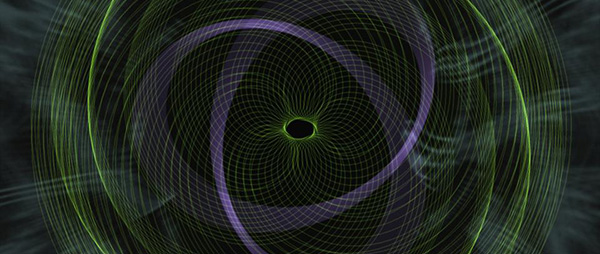
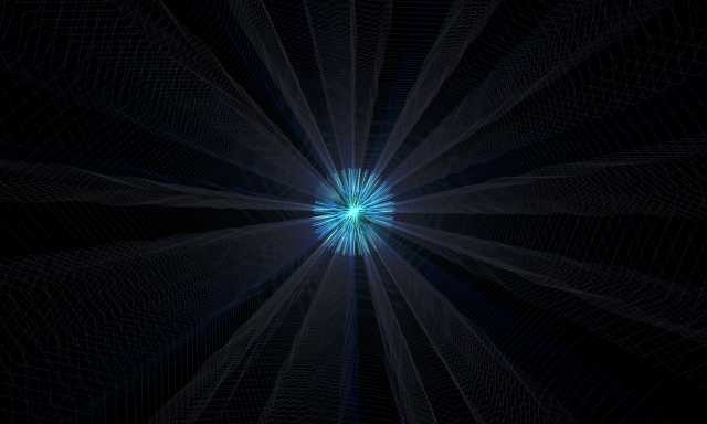
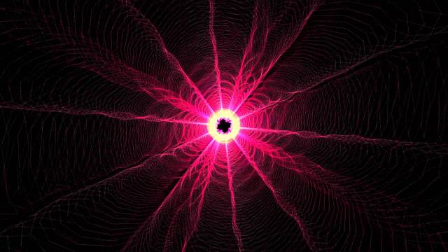
I applied the mandala idea in my effects art rather literally, creating mandala style portals. They use a black circle in the middle that spins to draw the player towards it, focusing them towards their goal. Rather than the circle getting bigger, like in Whitney’s work, the circle is perceived to become larger as the player walks towards it. The mandala is used in the opening of the game to allow the player to start concentrating on the game and, due to its association with meditation, set up the expectation that this is a meditative game.
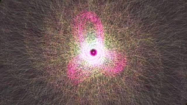
I also used these ideas to create my abstract fire effect. When designing the subUV texture for the fire, I started with large shapes and ended with smaller ones, meaning that the shapes appeared to get smaller over time and as they rose. This should pull the players view inward towards these shapes, compelling them to move forward within the game. I used a similar colour scheme Whitney’s mandala, coupled with an emissive material, hoping to replicate the entrancement provided by Whitney’s colour and light.
Early Game Design Influences and Idea Exploration
When beginning the research project, I was aware that it would be game effects based, but was unsure where my research question lay. At this point, I explored various games that featured effects fairly heavily to find out how they were being used. I found that they were used to show goals, to create atmosphere, to communicate emotion and to support narrative. It is interesting to note that I instinctively chose games that feature environmental effects and did not think about spell or weapon effects until later into the project. The level of examination of these pieces are fairly superficial as I was trying to find my feet with the project at that moment in time.
Effects to Support Narrative
The first pieces of media I examined were “Trine 2” (Frozenbyte, 2013), “Bioshock” (2K, 2007) and Tomb Raider 2013 (Crystal Dynamics, 2013). These games make use of effects to support the narrative, being used as visual aids to quickly communicate information about the environment to the player.
The sheer amount of effects used in the Wizard’s hut in “Trine 2” (Frozenbyte, 2013) support that idea that he is a magical character. By surrounding him with fire, magical objects and dust, the art team has made it clear that this character belongs in the fantasy genre. These effects use highly saturated colour, something that is not found in nature to emphasise the mystical qualities of the hut.
Effects are commonly seen in the environments of “Bioshock” (2K, 2007). These mainly consist of destruction related effects such as sparks, water dripping, fire and smoke, supporting the idea that the city is in complete disrepair. This heightens the sense of danger that the player feels, affecting their emotions by assuring them that not only should they worry about the game’s enemies, the environment could kill them too.
The dilapidated city’s architecture is based in the Art Deco period, an artistic movement that represented luxury, glamour, and faith in social and technological progress. (Visual Arts Cork, No Date) These are themes that are central to the Objectivist dystopian setting of “Bioshock” (2K, 2007), and reflects the views of Rapture’s citizens. When coupled with the heavy use of highly saturated emissive materials to create glowing neon signage reminiscent of Tokyo, New York or Las Vegas, the player is reminded of the luxuries that the characters of this world used to enjoy.
It is in the juxtaposition of destruction related effects and Art Deco glamour that the visual narrative can be found. By putting side by side evidence of the initial dreams of grandeur and the eventual fall into madness and ruin, the art team have shown how the Objectivist philosophy that Rapture was built on began as a dream of the elite, but could not possibly have allowed a society to function.
This is all made believable by the fact that every effect has a clear source and is integrated well into the environment, using colour and shape matching.
Though they may have not influenced my practical work directly, these games fed into my research project by causing me to think about game effects as a communication device, able to contribute to visual storytelling, rather than a spectacle or gameplay necessity. This got me started along the path to discovering my research aims.
Tomb Raider 2013 (Crystal Dynamics, 2013) is another game that uses its effects in order to support the narrative. The environmental effects reflect the main character’s emotions.
The overall artistic direction of this game was grounded, realistic and dark, seeking to promote a sense of” ominous beauty”. (BradyGames, 2013) This was promoted by the highly realistic nature of the effects as the developers aimed to evoke the player’s sympathy for Lara though believability in her situation. (BradyGames, 2013) The effects reflect her state of mind, as dangerous lightning is seen when she in fear and a snow flurry is seen at the top of a mountain when she has overcome this state. This is used so much that the artists have come to think of the environment as a personality of its own, with the effects making it come alive. (BradyGames, 2013)
Though again this example had no direct influence on the project, I can definitely see links between reading about and playing “Tomb Raider 2013” (Crystal Dynamics, 2013) and my decision to create a whole game based on effects, as this showed me the sheer amount of effects that modern games can have. The idea of the environment as its own personality was also something I was interested in at this stage, though it never came to fruition.
Effects to Telegraph Goals
“Fable 3”(Lionhead, 2010) and “Dead Space”(EA, 2008), are both games use effects in an interesting manner to support gameplay and telegraph goals.
“Fable 3”(Lionhead, 2010) uses a glowing trail to lead the player if they get lost. It is unobtrusive, as the gold, additive material blends very nicely with the environment and the trail disappears gradually, without popping. This trail has an abstract, magical feel, being made up of light and sparkles, allowing the player to believe that it is something they can only see, a “hero power” per say. This prevents obtrusive UI, like a map icon, whist also not ruining the environment design by putting in something physical. Candle light is also used to subtly guide the player in the right direction, as the player is naturally drawn to the warm light.
“Dead Space” (EA, 2008) also uses a trail to show the player where to go, this time a futuristic laser beam. It ties into the narrative by being a beam that Issac’s suit projects, again minimalizing the use of intrusive UI and blending nicely into the story. The dilapidation that was seen in “Bioshock” (2K, 2007) is also seen here, with smoke and water drips filling the abandoned space ship.
I used this trail idea within my prototypes, albeit more subtly than these games. I created a trail of candles in the opening of the game to lead the player into the mandala, bringing them into the main game hub. I then created glowing magic beams to indicate which portals are able to be entered, as players are likely to be drawn to the bright emissive glow, reminiscent of that seen in “Dead Space” (EA, 2008).
Focused Game Design Influences
Though at this point I had not discovered the idea of meditational gaming, the pieces of media in this section better reflect the path I went down in terms of creating my prototypes. My prototype’s general aesthetic was inspired by these pieces, as I moved away from the idea of narrative in games and towards interpretable thematic ideas.
Poetic Games
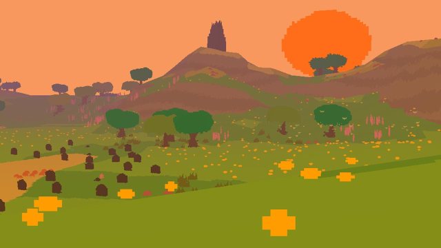
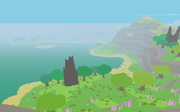
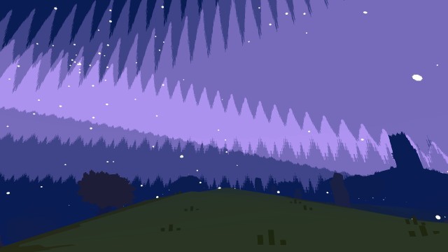
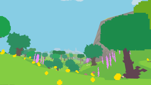
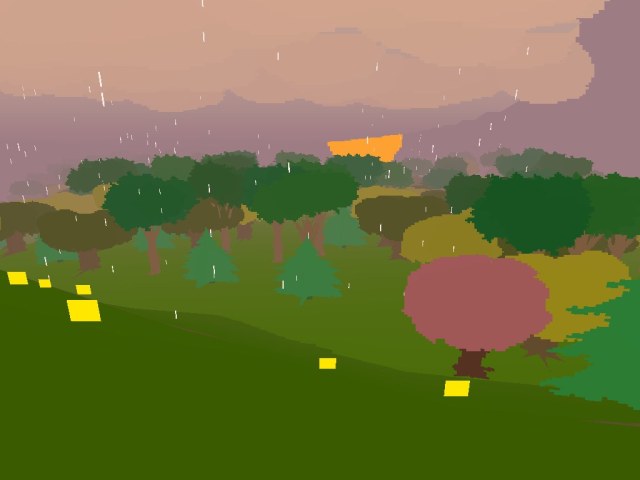
“Proteus” by Ed Key and David Kanaga (2013) is a poetic, thematic idea based game that was a major influence on my project. It combines audio and visuals into an ambient exploration piece.
When attempting to discover what makes this game so relaxing and pleasant to play, the first thing that I noticed was the sound. Kanaga creates a beautiful procedural soundscape that is absolutely delightful. The soundtrack is minimal, being built up over time as the player reaches different audio cues that play almost abstract sounds that represent the small animals and plants populating the island.
Despite audio being the initial stand out factor, the visuals play a huge part in making this experience what it is. The pure relaxation and happiness that the game radiates is in part delivered by the colour scheme. It is bright and saturated, utilising colours like green, blue and yellow which, as I previously mentioned when discussing Diablo 3, are cool and calming.
The simplified forms of the artwork in “Proteus” (Key, Kanaga, 2013) also lend to its calming nature, as the scene is very easy on the eye and each element separates nicely. This design echoes the visual deprivation found in meditational imagery, as it takes away unnecessary details to let the viewer focus.
The subtle movement of the environment when coupled with the fantastic ambient soundtrack make the world come alive and feel like a true place to explore. The moving animals give the player something to follow if they are unsure how or reluctant to proceed without direct instruction. This is important as many game players are used to being given explicit goals and directions, and can become confused or give up in a more experimental experience.
A particular effect that I liked in this experience was the paricles that formed a circle for the player to step into, in order to change level. The particles start to drift in from all over the island, so that the player can start to follow them. These bright white particles stand out well against the hues of the rest of the art so are easy to find. The start to spin quickly in a ring shape, using the cirular motif to make sure the player remains happy, but using the tummulnous movment to suggest that something exiting is about to happen.
The setting and initial moment in “Proteus” (Key, Kanaga, 2013) is incredibly important. As the game opens, the player opens their eyes and can see an island with a large mountain. Having the island presented to them in this manner introduces Proteus’ setting as a liminal space (Stuart, 2013) where the player can explore their inner self. Being the tallest element in the composition, the mountain draws the player’s eye, with them instinctively walking towards it and knowing that journeying to the island will begin their adventure. I have been referring to this initial goal telegraphing combined with a bit of spectacle as a “wow moment”.
“Proteus’” (Key, Kanaga, 2013) main influences on my prototype are the ideas of sound and art in tandem and managing the player’s expectations from the beginning of the game. In the opening moment of my game, the player is in darkness and all that they can see is a candle trail leading to a mandala. Though I have previously discussed where these ideas come from as individual components, the idea to arrange them purposefully in this way comes from Proteus. It shows that in order to create a successful aesthetics driven experience, the player must be introduced to this idea at the start, rather than just dropped into the game.
This piece also led me to pick an ambient piece of music to play throughout my game and to add sound effects in each of the different corridors. These additional pieces of audio layer like in “Proteus” (Key, Kanaga, 2013) to support my colour and mood shifts nicely. I will keep Kanaga’s work in mind when working with a sound designer next semester to create professional audio for my final project.
I considered using a similar style to the level changing effect for the ending of my prototype, but instead opted for a more “Flower” (thatgamecompany, 2009) like finish, which I will discuss later. Moving foward, if I am to have multiple levels in my game, this is something I will consider.
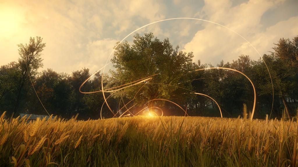
“Flower” (thatgamecompany, 2009) by the critically acclaimed studio thatgamecompany, explores emotion and atmosphere though its effects and gameplay, also utilising this poetic style.
The effects in “Flower”(thatgamecompany, 2009) are used to subtly direct the player towards their goal, with wind trails pushing the player back and forth and shining light particles appearing to indicate an objective met. As the game as no clear narrative or direction, the player disregards goal-oriented thinking and feels their way through the landscape of effects. The subtle movement found in this environment brings the world to life, which is essentially the goal of the game. These small effects, like petals on the wind or lights in the grass make the world much more appealing. Their dissipation when the player approaches them again adds life to the world.
Ultimate level ending goals are shown though swirling ribbon effects that mimic the soft movement of the wind. This repetition, though more explicit than the wind effects, uses the idea of shape harmony (Dondis, 1973) to provide a sense of calm throughout the experience. When the same shapes are found in both the player and the environment, the player will have a sense of safety and security.
“Flower” (thatgamecompany, 2009) does not have a direct story, instead opting for a poetic, emotion driven experience much like “An Optical Poem”(Fischinger, 1937) that was discussed earlier. “Flower” (thatgamecompany, 2009) presents an entirely new kind of physical and virtual choreography unfolding in real time, one that invites participants to weave aural, visual and tactile sensations into an emotional arc rather than a narrative one.”(Smithsonian, 2013) This is supported by each level’s colour scheme, the changing saturation and colour choices reflecting this “emotional arc” (Smithsonian, 2013), as each represents a different aspect of the theme of nature in harmony with the city (Smithsonian, 2013). For example, the lush greens of the first level celebrate the beauty of nature, whereas the dark blues of the night time level explore how electricity and nature work together.
“Flower” (thatgamecompany, 2009) was a large influence on my project. As I looked at this before I discovered abstract animation as relevant to my project, it was “Flower” (thatgamecompany, 2009) that made me opt for a thematic game as opposed to a narrative based one. I have imitated on a very small scale the way that different areas explore different aspects of a theme, creating three corridors with different colour schemes and effects. Each one of these represents a different aspect of the balance of health from the Japanese Reiki tradition(Matsumoto, Juang, 2012), with the green room featuring nature being the emotional aspect, the blue room featuring water as the mental aspect and the red room featuring fire the physical aspect. The colours that go along with these traits were chosen deliberately in accordance with the “Diablo 3” (Blizzard Entertainment, 2012) process I discussed earlier. All of these come together to create the spiritual aspect (Matsumoto, Juang, 2012), in the form of a tree in the main hub area. As the player moves though each corridor, a set of lights in the corresponding colour appear on the tree, much like opening a bud in “Flower” (thatgamecompany, 2009).
The ending of my prototype is also heavily influenced by this game. Once the tree has all three sets of lights, a ribbon effect inspired by “Flower’s” (thatgamecompany, 2009) level ending goal effect swirls around the tree. As I do not have any other effects with this type of movement in my game, it does not replicate the shape matching found in “Flower” (thatgamecompany, 2009), but it does utilize colour matching. The colour over life for this effect uses the green, red and blue found in each corridor to symbolise the aspects coming together to create the spiritual self.
Aesthetics Led Design
While “Journey” (thatgamecompany, 2012) is slightly more narrative based, it shares ideas with “Flower”(thatgamecompany,2009) and “Proteus”(Key, Kanaga, 2013). The effects are also used in this game to make the world feel alive, with the shimmering powdered sand giving the environment a rich texture. The dust, smoke and heat ripples combine with this to make the world seem warm and exotic.
Effects are again used to define goals, with ribbon trails and shining particles appearing when objectives are completed. When combined with the Islamic style architecture of the world, a spiritual feeling is produced.
Both of these games are highly emotional, as thatgamecompany uses an aesthetics driven design process that looks towards emotions as a starting point for game design (Gamasutra, 2013). This is part of the Mechanics-Dynamics-Aesthetics (MDA) design methodology. This framework breaks games into three distinct components. Mechanics, being the features and components that the game includes on a programming level, dynamics being the actions that happen within the game at run-time, including desired and emergent gameplay, and aesthetics being the anticipated emotions that the player expresses in response to the game. (Hunike, LeBlanc, Zubeck, 2004) Robin Hunike, producer of Journey, suggests that using this backwards creates successful, emotion driven games. “Think of the aesthetics first…think of the feelings you want to bring to players. I believe that if you start with the aesthetics and move backwards towards the mechanics though the dynamics, you can create successful games.” (Gamasutra, 2013)
Special notice can be applied to Journey’s colour schemes and their similarity to other works of art.
JMW Turner used colour extensively within his expressionist works to communicate emotion and the non-representational idea of landscapes.(Bookemul, 2000) Using Olafur Elission’s “Turner Colour Experiments”(Elison,2014) , his schemes can be broken down and compared to “Journey” (thatgamecompany,2012) as its overarching idea is that of the hero’s journey and its similarity to various stages of life. “Colour experiment #57” (Ellison, 2014) is based off of “Burning of the House of Lords and Commons” (Turner, 1834), a piece which depicts an energetic and violent fire. This can be compared to the second part of the sand level in “Journey” (thatgamecompany, 2012), in which the developers are communicating the idea of energetic and violent risk taking as a teenager. (CoCreate, 2012)
The main aspect that I derived from Journey was my game design method. I used the backwards MDA framework to attempt to create a relaxing experience. I had calm and peace at the forefront of my mind when designing elements of the game, to make sure that they all contributed to this feeling. Rather than starting out with a mechanic for the game, I worked backwards though feeling, meaning and interaction. As previously discussed, I also used the idea of shifting colours.
Moving Towards Meditational Gaming
After playing “Flower” (thatgamecompany, 2009) and watching Richard Lemarchand’s talk on virtual reality technologies and self-reflective gaming (Abertay University TV Channel, 2014), I realised that what I really love about games like “Flower”(thatgamecompany, 2009) and “Proteus”(Key, Kanaga, 2013) is how relaxing they are. The way these experiences can be used to tune out daily stresses is akin to a meditational experience, and I was eager to explore interactive media as a means for meditation.
Abstract Games
At this point I looked at a couple of games that were mentioned by Gamasutra’s Ben Servis (2013) as meditational. These games use abstract mechanics to create an experience different from the norm in gaming.
“The Endless Forest” (Tale of Tales, 2006) has been described as an interactive social screensaver. The only point of the game is to enjoy the idyllic, peaceful space. (Tale of Tales, 2006)
I felt there was something lacking with this game. The pure wonder that I get when playing a game like “Flower” (thatgamecompany, 2009), or “Proteus” (Key, Kanaga, 2013) was missing. I believe that one of the reasons for this was the 3rd person camera. When I zoomed in from the almost isometric style view into more of an over the shoulder view, I felt more engaged, but something was still lacking. The human faces on the deer were also a bit unsettling and uncanny valley like. Their purpose may have been to make the deer feel more human and therefore allow the player to empathise more, but why then not use a first person view with other players looking like these human-deer hybrids?
I also think that the dark, muted colour palette contributed to this issue. “Flower” (thatgamecompany, 2009) and “Proteus” (Key, Kanaga, 2013) use bright palettes that are stimulating, whist “The Endless Forest”’s (Tale of Tales, 2006) dark greens and browns were uninspiring to look at. The art also leaves a lot to be desired, with obvious bill boarding and stretched textures on the ground. There are hardware limitations, as this an MMO being run on a tiny server, but perhaps the answer to that issue would have been to go for a more heavily stylized look, following in the trend of large MMOs like “World of Warcraft”(Blizzard Entertainment, 2004) or “Warhammer Online”(Mythic Entertainment, 2008).
Another contributing factor may be the lack of movement in the world. My other research has constantly emphasised how effects and environmental animation makes worlds come to life, but this is not seen here.
One good thing about this game is its relationship to traditional art. One of the areas that I did really like in the game was called “De Drinkplaats” and was inspired by a 16th century Flemish painting of the same name (Tale of Tales, 2009). The area was created when the designers were invited to exhibit The Endless Forest alongside similar paintings. They wanted to allow the visitors to the gallery to fulfil the romantic desire of stepping into a painting and becoming immersed in it (Tale of Tales, 2009).
This game taught me what does not work, rather than what does. It has further reinforced the idea of movement and saturated colour, as well as reassuring me that I do not need to try out other game modes for my prototype – first person works fine. Its link to traditional art inspired me to look beyond games not just for effects, but for game design too. I am interested in basing the more realistic portions of my game off of traditional art.
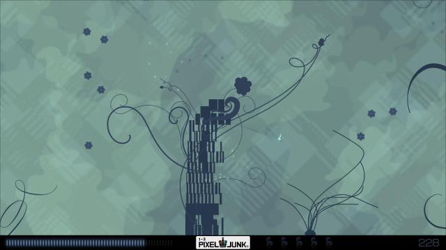
“PixelJunk: Eden”(Q-Games, 2009) is almost like a 2D version of “Flower” (thatgamecompany, 2009), with the player traversing an abstracted landscape to make plants bloom.
The abstract graphic style of the game is influenced by both the artist, Baiyon’s, personal work and Japan’s modern culture (Siliconera, 2008). Baiyon’s fascination with the video games of the 90’s and 80’s (Siliconera, 2008) is reflected in his personal artwork, being full of geometric, pixel-like shapes, and simplified representations of animals.
This game is similar to “Flower” (thatgamecompany, 2009) in that is uses a shifting colour scheme to change the mood of the game and show the player’s progression, this time trying to get across the feeling that there is a formidable challenge for the player to surmount. (Siliconera, 2008) The creators saw the planning of the game’s levels like planning the order of songs in a music album (Siliconera, 2008) again emphasizing a poetic structure over a narrative based one.
The flow of gameplay in “PixelJunk: Eden” (Q-Games, 2009) works particularly well, with the repetitive, smooth swinging motion working in place of a mandala or chant to create a trance state. The player gets lost in the rhythm of the game, losing their sense of time and worry.
Playing “PixelJunk: Eden” (Q-Games, 2009) was encouraging as it showed that an abstract, meditational experience can be created though games that are not purely experiential and use more traditional game mechanics. Though my main focus will be on the artistic side of games, I have an investment in the medium’s ability to provide calming, introspective experiences and therefore wish to see this in many types of games. The alignment of Baiyon’s artwork and the abstract work that I have been looking at proves that this style of game art works, allowing me to feel comfortable experimenting with abstract effects and environments.
Visual and Sensory Deprivation
“A Light in Chorus” (Johnson, Warsaw, 2014) uses visual deprivation and point rendered artwork to create a world that appears to be made of particles. I discovered the trade demo of this game at Eurogamer Expo 2014 and was lucky enough to get an interview with the developers.
The developers looked at the history of visual technology, such as sonar and lidar scans to create their unique visual style. They wished to explore the haunting quality of dot based representation of areas within an interactive space. (Johnson, E. 2014. pers. comm., 2 October).
The other inspirations behind this game were very similar to mine, with meditation and Proteus being two of the larger ones. Johnson, one of the developers, talks about Proteus as a concise aesthetic experience, akin to meditation, and how this is something they would like to replicate. (Johnson, E. 2014. pers. comm., 2 October). I think the visual deprivation that is found within their art style really feeds into this, with the player filling in the blanks in the black spaces themselves, much like in abstract animation. The glowing light style of rendering also contributes, as the eye is drawn to warmth and areas of high contrast, much like in James Whitney’s work.
While this art style may make the player feel meditative, the team were going for a very particular type of calm. They aimed to produce the feeling of awe and wonder felt when the familiar is made strange by emptiness and quiet, like walking around a small town or suburb at night. When the mundane takes on new significance, it clears a way to think about things differently, and self-reflect, much like in meditation. (Johnson, E. 2014. pers. comm., 2 October)
A Light in Chrous’ interaction design was drawn from the Situationist art movement, which looks at playfulness in urban environments and integrating art into the everyday. (artmovements, unknown) This again looks at the familiar made strange, but communicates it into the mechanics of the game, where the player can swap out environment objects to make places whole again.
This game made me confident to go down the meditational games route, as it shared inspiration with my prototype. It also influenced my decision to include pure black walls in the hub and entry rooms of the prototype, so that I could try and replicate this visual deprivation in order to focus the player’s concentration and aid their relaxation. I made heavy use of emissive materials in my abstract rooms to replicate the way that the eye is drawn to the glowing lights in “A Light in Chorus” (Johnson, Warsaw, 2014).
Moving forward, I am interested in looking into Situationism to add more gameplay to my prototype, or to create a way in which just moving around the space is playful and engaging.
“Soundself” (Arnott, 2013) is a very direct meditational game, seeking to create a bridge between the mental and the physical self though chanting and sensory deprivation. The game does not allow the player to take control of it, but instead creates harmony between the game and player though meditation and trance (Gamasutra, 2013).
This is another game that makes heavy use of visual deprivation and contrast to induce a meditational state in the player. The main screen is black, with brightly coloured shapes appearing on the screen in reaction to the player’s voice. This echoes the ideas found in Whitney’s work and in “A Light in Chorus” (Johnson, Warsaw, 2014). The game is played using an Oculus Rift, which adds to the feeling of isolation and sensory deprivation, by physically blocking out the real world and replacing it with the entrancing space of “Soundself” (Arnott, 2013).
The abstract shapes found in this game were influenced by nature, with the first design meeting for the game being a hike along the historical path of the San Marcos River. There the developers discusses fluid dynamics, shifting continents and galaxies, these eventually forming into the fluid, shifting shapes that the player creates with their voice (Arnott, 2013).
“Soundself” (Arnott, 2013) draws on the ideas of the history of meditation technologies, with Robin Arnott, its creator, placing his game alongside mandalas, group-aums and sensory deprivation chambers. He aims for the piece to be an external tool for internal exploration. He describes the game as trance, and believes that it elevates the player’s consciousness to a dynamic multi-sensory reality and therefore creates a sense of calm peacefulness. (Creator’s Project, 2014) Part of the meditation comes from the game design idea of flow, where the player has complete energized focus on the activity and loses sense of time. Arnott compares flow to a trance state (Creator’s Project, 2014).
An interesting note about “Soundself” (Arnott, 2013) is that when I played it, though I felt this flow, trance state at times, I also felt quite frightened, possibly due to the isolation felt when wearing the rift.
The main aspect I drew from “Soundself” (Arnott, 2013) was the use of the Oculus Rift as a meditation device, and its usefulness in blocking out sensory stimuli. It inspired me to create my second prototype in the rift, and I think that the game is much more effective due to this. It also warned me of the possibility of inducing anxiety in those playing when using the Rift, so moving forward I will make a conscious effect to reduce any stimuli that may frighten the player. A possible way of doing this is to draw from Proteus’ eye opening moment, with the player closing their eyes at the beginning of the game, and offering a key that will open them into a menu or neutral space. This eye technique is often used in traditional meditation.
“Guided meditation for Oculus Rift” (Cubicle Ninjas, 2014) is a meditation simulator, designed to be played with the DK2 headset. It is a literal meditation game, which brings the player into a visual guided meditation.
The use of the Oculus Rift for sensory deprivation, as has previously been discussed, works fantastically here, shutting out the real world and transporting the player to a new, peaceful world. The world that the visualisation puts the players in is a great start for meditation, as it helps to jump start the process of clearing the mind. However, once a meditative state is reached, it is common to close the eyes, and if kept open, the visual stimuli gets rather distracting, especially on those areas with movement. This is contradictory to other examples, where movement brings life to the world. This is because this game asks the player to literally meditate, rather than putting them in a meditative state.
Another issue here was that the Rift can cause simulator sickness and headaches, especially when the user is tired (Oculus VR, 2013). I am not sure about others, but I tend to meditate at night, to clear away the worries of the day, so felt quite unwell when playing, defeating the purpose of meditation.
The levels are representations of common guided meditation themes, including a beach, a canyon and a forest. These areas were very literal, and did not seem to push visual elements in order to enhance the meditational experience.
Playing this game showed me that while I want to create a meditative experience, I do not want to create a straight up meditation simulator. I want to create a game world that a player can explore and feel relaxed and meditative within, rather than asking them to meditate directly. The idea behind this is that this relaxed, timeless feeling can be brought to people who do not practice meditation, or find it difficult to focus on.
It has made me aware that there may be quite a lot of issues when using the Oculus Rift as a presentation method, so I will have to be very careful if I decide to pursue this presentation method. I will have to make sure that all my research participants feel safe when playing, as talked about earlier when I mentioned an anytime exit to the game. It has also made me consider alternative presentation methods. I may draw on the locations found in this game in my own work, but will likely change their visual elements to better express the emotions I am trying to convey.
